


Next: Histogram volume calculation
Up: Mathematical foundations
Previous: Studying , , and
The transformation from position domain to value domain
Figure 3.5:
Relationships between  ,
,  ,
, 
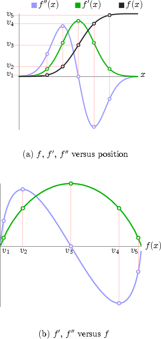 |
Remember that our ultimate goal is to arrive at a transfer function
that makes the values at the boundary opaque. Observe that in
Figure 3.5(a), the data value increases
monotonically4. This means there is a one-to-one
relationship between the data value and position. Therefore, it is
possible to transform the first and second derivatives from functions
of position to functions of data value. Five data
values,  through
  , have been indicated on the vertical axis.
The pattern of horizontal and vertical lines shows that for each of
these five data values, we have an associated first and second
derivative values. This association is formed through the
relationship between data value and position which is governed by the
graph of . If we were to plot the derivatives associated with data
value as we moved through the range of data values, we would get the
curves seen in Figure 3.5(b). Data value, not position,
is on the horizontal axis, on which through are shown.
The crucial change is that information about position has been
entirely removed from the picture, and we are left with the
relationship between the data value and its derivatives.
, have been indicated on the vertical axis.
The pattern of horizontal and vertical lines shows that for each of
these five data values, we have an associated first and second
derivative values. This association is formed through the
relationship between data value and position which is governed by the
graph of . If we were to plot the derivatives associated with data
value as we moved through the range of data values, we would get the
curves seen in Figure 3.5(b). Data value, not position,
is on the horizontal axis, on which through are shown.
The crucial change is that information about position has been
entirely removed from the picture, and we are left with the
relationship between the data value and its derivatives.
There is a more elaborate conception of the graphs portrayed in
Figure 3.5(b) that is well worth describing, since it can
give us a more intuitive feel for why those graphs have their
particular shape. For the time being, consider just the relationship
between data value and the first derivative. Both of these quantities
are functions of position, so we could draw a three dimensional graph
showing this, as in Figure 3.6.
Figure 3.6:
The three dimensional plot of and as functions of
position  is projected along the three different axes so
as to demonstrate the relationship between each pair of variables.
is projected along the three different axes so
as to demonstrate the relationship between each pair of variables.
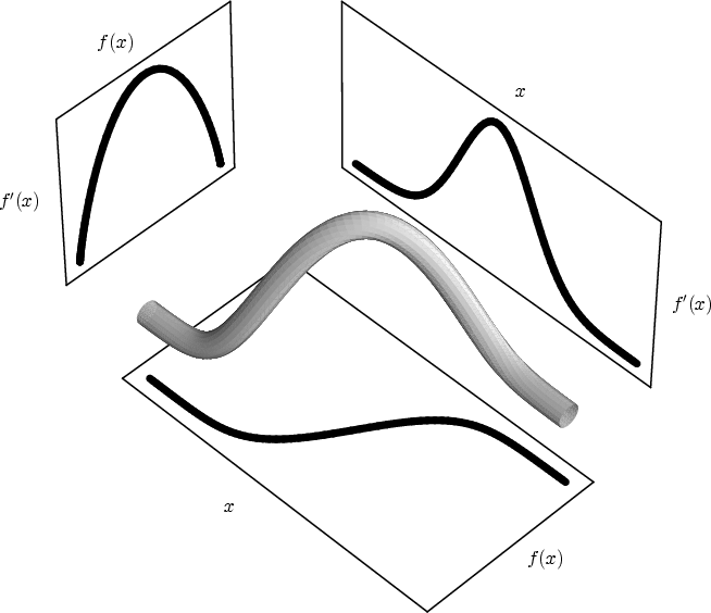 |
Below the three dimensional curve we see data value versus position,
and to the right, first derivative versus position. Both of these
graphs are projections of the three dimensional curve. But there is a
third way to project this curve: parallel to the position axis, so as
to cast away all position information. We are then left with the
relationship between data value and first derivative, exactly the
curve seen in Figure 3.5(b).
The same can be done for the relationship between data value and its
second derivative, as seen in Figure 3.7.
Figure 3.7:
The three dimensional plot of and as functions of
position is projected along the three different axes so
as to demonstrate the relationship between each pair of variables.
 |
In the projections which are below and to the right of the
three dimensional curve, we recognize the graphs of data value versus
position and second derivative versus position. But again, we can
project the three dimensional parametric curve along the position
axis, distilling out the relationship between data value and its
second derivative, to get the second curve in
Figure 3.5(b)
Now that Figure 3.5(b) is more thoroughly motivated, we
can represent its content in a different way. Since we have
``projected away'' position information and reformulated the first and
second derivatives as functions of data value, we can create a
three dimensional plot of the first and second derivatives as
functions of data value, as seen in Figure 3.8.
Figure 3.8:
The three dimensional parametric plot of , , and
is projected along the three different axes so as to
reveal the position-independent relationships between these
three variables. The cross-hairs indicate the positions
along the curves corresponding to the middle of the boundary.
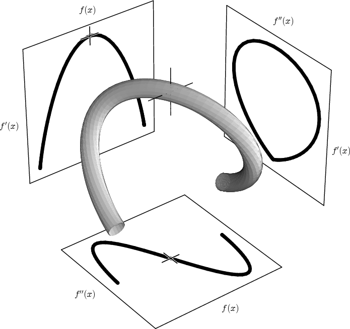 |
We recognize that two of the projections of this curve are the same
as in Figure 3.5(b). The full three dimensional curve has
an approximately helical shape, as evidenced by the fact that the
third projection of the curve (upper right) closes back on itself.
The significance of these curves, the three dimensional one as well as
its projections, is that they provide a basis for automatically
generating opacity functions. By analyzing an ideal boundary we have
arrived at a position-independent relationship between the data value
and its derivatives. Therefore, if a three dimensional record of
the relationship between , and for a given dataset
contains curves of the type shown in Figure 3.8, we can
assume that they are manifestations of boundaries in the volume.
With a tool to detect those curves and their position, one could
generate an opacity function which makes the data values corresponding
to the middle of the boundary (indicated with cross-hairs) the most
opaque, and the resulting rendering should show the detected
boundaries. Short of that, one could use a measure which responds to
some specific feature of the curve (the zero crossing in , or the
maximum in ) and base an opacity function on that. This is the
approach taken in this thesis.
Footnotes
- ...
monotonically4
- This is, of course, the ideal situation. If
the segment along which and its derivatives has been measured does
not lie directly between large regions of two distinct materials, the
monotonicity condition may not hold. Again, we rely on the
statistical properties of the histogram to provide the overall picture
of the boundary characteristics.
Next: Histogram volume calculation
Up: Mathematical foundations
Previous: Studying , , and